-
×
 HERVE Clothing store Shopify theme - Clean, minimal, stylish design
1 × 29 $
HERVE Clothing store Shopify theme - Clean, minimal, stylish design
1 × 29 $ -
×
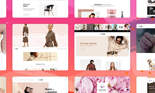 FELLIO Creative Minimalist Shopify Theme
1 × 29 $
FELLIO Creative Minimalist Shopify Theme
1 × 29 $ -
×
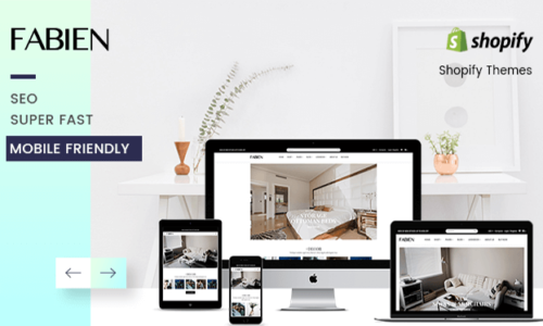 FABIEN Sectioned Shopify Theme for Furniture Store & Home Decoration
1 × 29 $
FABIEN Sectioned Shopify Theme for Furniture Store & Home Decoration
1 × 29 $
Subtotal: 87 $